- 5 Posts
- 51 Comments
No doubt.
git rebaseis like a very sharp knife. In the right hands, it can accomplish great things, but in the wrong hands, it can also spell disaster.As someone who HAS used it a fair amount, I generally don’t even recommend it to people unless they’re already VERY comfortable with the rest of git and ideally have some sense of how it works internally.
Damn, they must be charging an arm and a leg then, or your firstborn perhaps.
Here’s another one, catch!
This isn’t rocket science!
No. It’s computer science.
 2·10 months ago
Yeah, I wasn’t asking for a fix, just for an explanation.
I’m glad you agree. Honestly, as someone who has also struggled with this question, I wish I’d done this earlier, because there’s a lot of advantages to it.
It takes a lot less planning and upfront time investment before you get to see your work make a difference in the world. It’s not immediate gratification, mind you, because pull requests can sometimes sit there for days or weeks before someone has the time to review them, but when they get merged, and you get to see the feature you worked on in an app you actually use, it’s still a great feeling.
Most projects will also give you contributor credit, so your name and/or GitHub handle will show up on their repo, website, or in the app’s “about” page, and you can claim that on any job application you might submit in the future.
I honestly think it’s a great way to scratch your own itch (because you can pick what issues you want to work on and build features you’d actually want to use) while also helping other people and benefitting open source as a whole. Any reasonably popular project generally has a massive backlog of open issues, so if you’re at a loss where to even start, you can just look through there and pick something that seems doable.
Yeah, I think you’re already on the right path with that, those are good basics for anything computer science related (and usually required classes if you take CS in college). Perhaps add Numerical Analysis to that list.
Also, Operations Research has some interesting optimization algorithms, and Statistics is useful for anything related to Machine Learning.
I’m a mathematician by training who has worked extensively (and exclusively) in the software field. While I realize I’m probably biased here, I think I write very solid code and have rarely received any complaints from trained software engineers about it.
I did however also take quite a few computer science classes in college and have spent a lot of time learning how to write better, more readable and maintainable code. Having had quite a few jobs at the start of my career where I was the only programmer on a project and therefore forced to eat my own dog food has certainly also helped.
Instead of starting your own project, have you considered simply contributing to an existing open source project instead?

 1·10 months ago
Yeah, sorry I didn’t realize the post was this old when I responded to it. Not sure why it popped up on my feed right among a bunch of much more recent ones.

 1·10 months ago
This feels like something that was written by an AI, except for the last sentence.

 2·10 months ago
It’s been a while since Apollo stopped working and I never even knew about this feature back when it still did, so I have a bit of trouble picturing it. Can you explain HOW this worked, exactly?
When you long pressed on a comment, would it scroll up to the immediate parent, or did it collapse all the other children of the same parent (or only those above the comment you pressed on), or what?

 2·10 months ago
What if there was an option to customize what happens on a long press on a comment?

 1·10 months ago
What are you talking about, you totally CAN reply with an image.

See?

 2·10 months ago
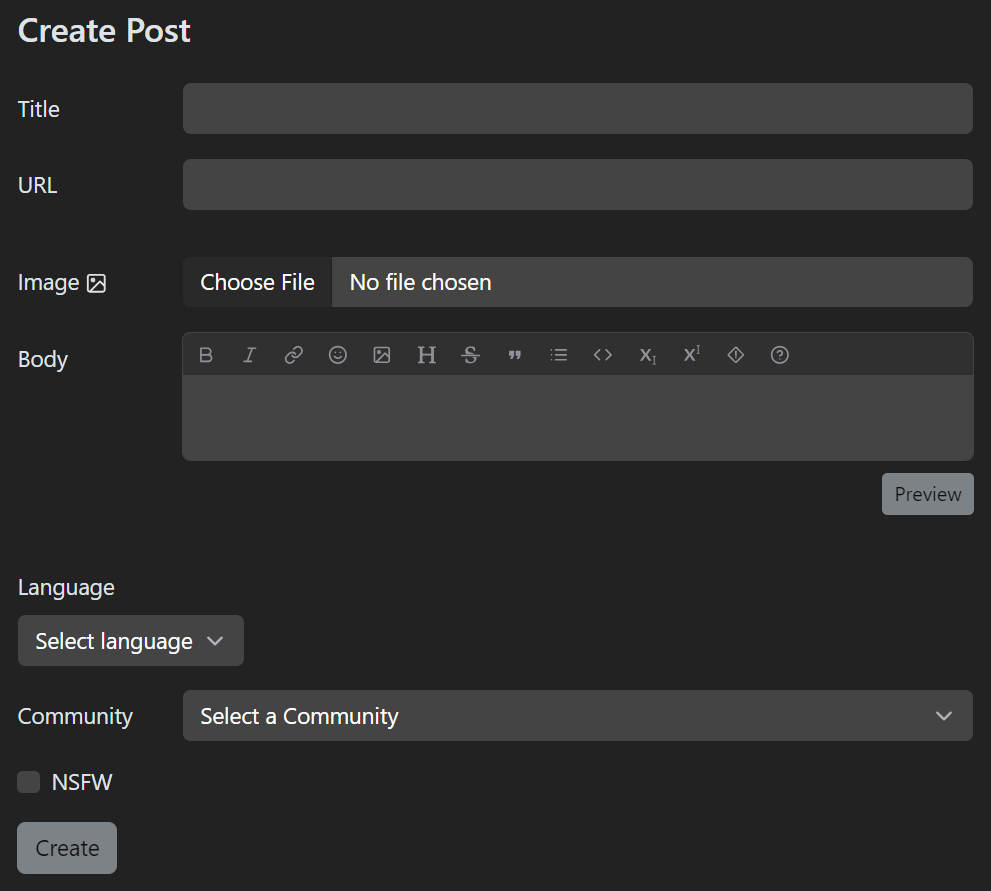
This isn’t any different from how OG Lemmy works.

You can only have single image on the post itself, if you want to add more, you have to add them via Markdown in the body.
Unfortunately there isn’t any support for gallery type posts at the moment, but feel free to badger the devs about it. Looks like there’s been an open issue about this since 2020.
Weird, both the official Reddit app and Lunar for Lemmy also have a custom icon feature and they don’t seem to be having the same issue.
Even after restarting my phone in order to fix it, Voyager “forgot” its icon again after simply closing and reopening it. I did not even change the icon.
EDIT: after some experiments I found out that this problem only seems to occur when the “O.G.” is used. Is the iOS app perhaps simply missing a small version of that icon?
Yeah I don’t see it either.

 1·11 months ago
I mean, if you can start a new post from anywhere but then still have to select the community to post it to from the post editor, I’m not sure how that saves you any clicks.
What’s the advantage here?
I’m not sure that’s a bug, that’s always been like this IMO. Every tab has its own history, so if you switch tabs and later go back, it’ll be at the same place you left off. I.e. if you last had the “Unread” box open when you were on the inbox tab, that’s what you’ll see when you go back there.


I highly doubt it, most frameworks do indeed automatically prevent it these days. Still funny though.